New brand, new site.
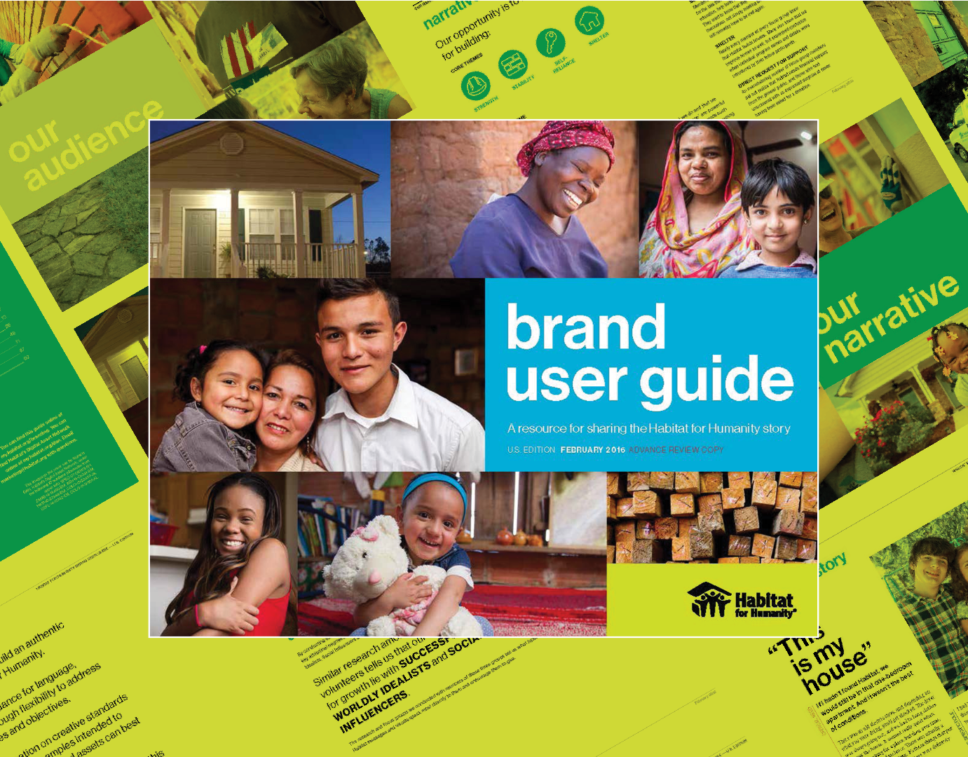
Following the launch of the new brand standards Habitat for Humanity also required a redesign of the website from the ground up. Our focus was to improve navigation, make call to action functions clearer and easier to access, and implement the new standards into the build. We partnered with a 3rd party development agency and as the designer I assisted with designing the web pages in InVision to ensure brand consistency before sharing with development team for production.
Rethinking the information architecture.
To kick off the project I ran several design workshops with the various stakeholder, and users who would ultimately use the site. In these meetings we conducted card sorting projects, and user surveys to determine the overall architecture of the site.
Three main personas, two part navigation solution.
Starting from scratch (paper).
Once we knew the information architecture I got to work in building low fidelity wireframes to test with our hypothesis of user flow. This was also the point I brought in the development team to talk about feature functionality and feasibility.
Hand off from paper to product.
Once the prototypes was tested, approved, and development team had a back log of functions required for build I moved forward into building the high fidelity wireframes.
Learnings moving forward.
The most important take away from this project was the need for modular design in large enterprise websites. Modular designs allow for flexibility to create multiple different web pages and component while working within the established patterns. Another element I would like to add to continue to improve the site is motion design improve the wow factor.


